Swedens Radio Design sprint
A mission to reach more young listeners
Overview
A fully remote three day design sprint exploring Sweden’s Radio and ideas that would interest more young adults in Sweden’s Radio network.
Design sprint process consisted of user research, user testing, creating concept sketches, and re-iterating the design according to user feedback.
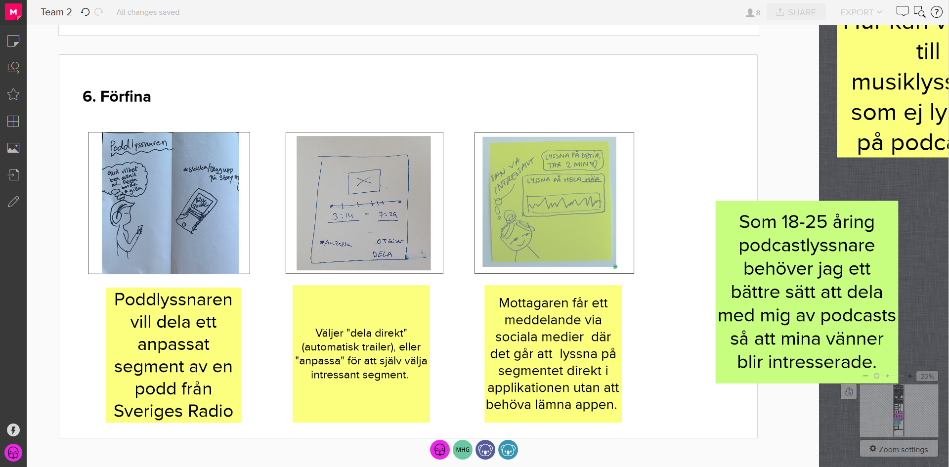
The result was a concept that would allow the SR application users to share a specific segment of a podcast/radio program on social media. The clip can be played directly with the option to listen to the entire podcast on the users native podcast application.
Client
Swedens Radio
Deliverable
Product concept
My Role
UX Researcher
Project Time
12-14 Aug 2020
Tools
Mural
Google Hangouts
Google Presentation
Pen and Paper
My Role
My role in this design sprint was that of the UX Researcher. I worked with a team of designers to conceptualise, facilitate user research and user testing, create Lo-Fi mockups, and present the concept to the stakeholders from Sweden’s Radio.
The Challenge
Sweden’s Radio has a broad catalogue of public radio programs and podcasts in a variety of fields. They have a website, iOS/Android application, and FM/AM radio broadcasts.
The current problem is that not enough young adults are listening to – or even aware of – Sweden’s Radio. This is quite the problem when the mission statement of SR is to have a broad outreach amongst Swedish citizens.
This design sprint aims to solve the challenge of encouraging young adults to listen to Sweden’s Radio using one of SR’s digital platforms.
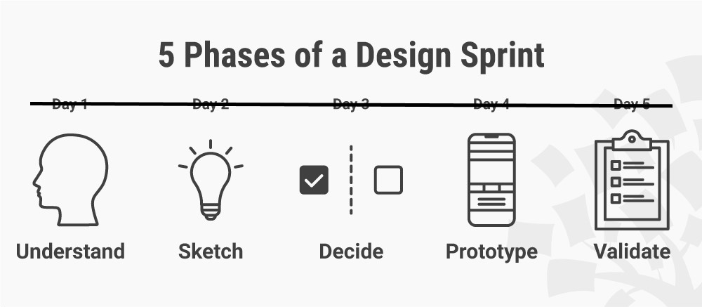
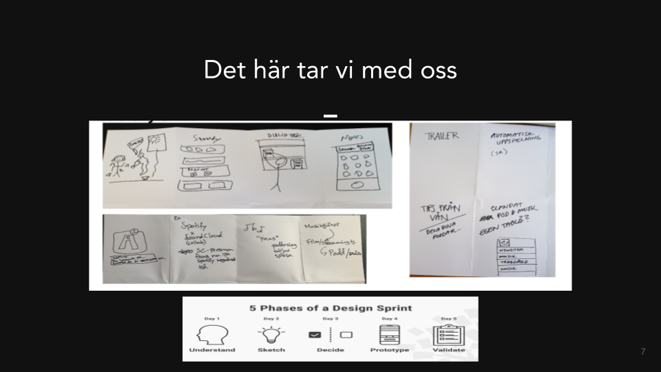
Design sprint summary
Day 1
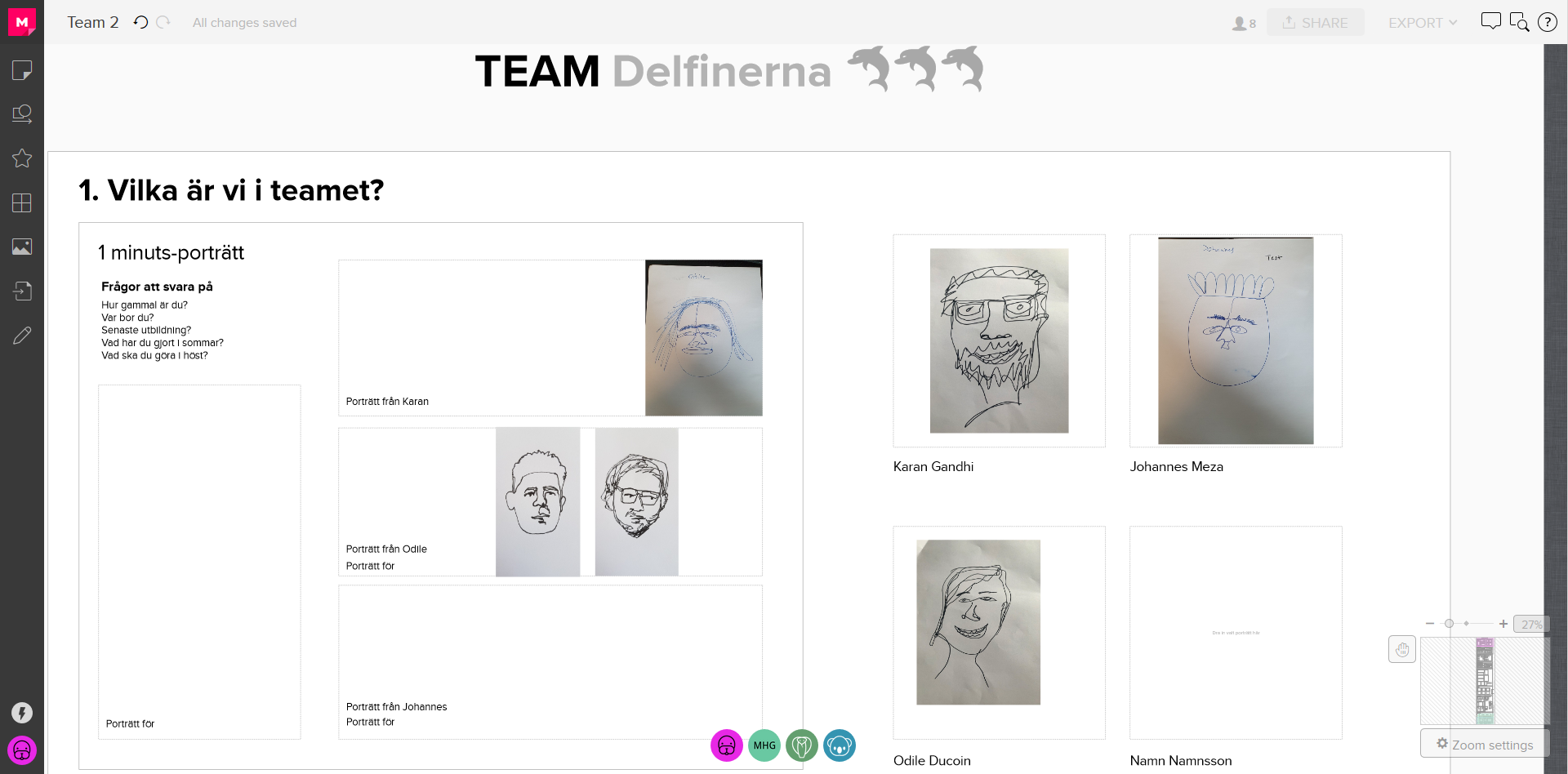
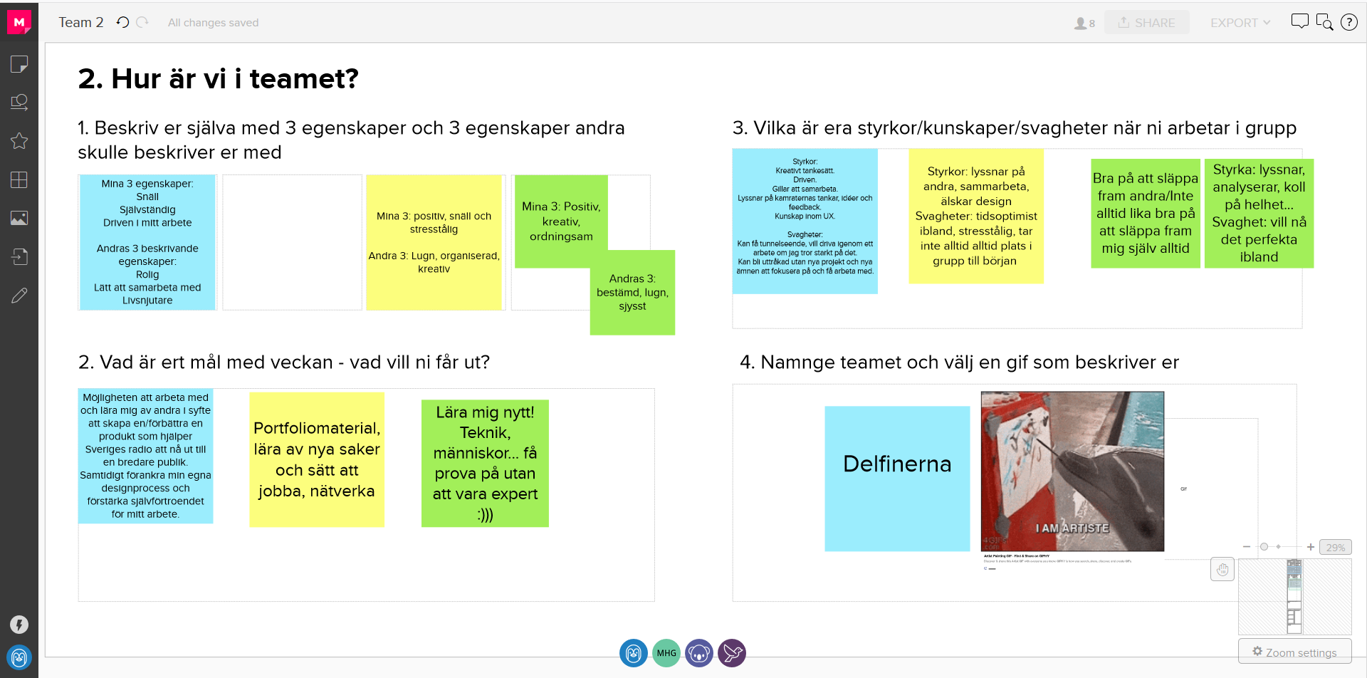
Meeting the team members and facilitator for the first team. Got to know eachother through exercises and discussions about our goals, strengths, weaknesses, and thoughts on the brief.
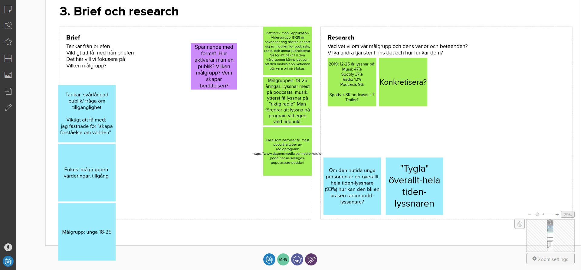
The brief was analysed once again and discussed in-depth. The goal was to reach a common consensus regarding what the brief meant and how we would approach solving it.
A hypothesis was formulated upon factors such as who our user group was and what type of needs and difficulties we would like to create a solution for. A ‘one-sentence’ hypothesis was then formulated to help us narrow down the scope of the brief and to easier focus on this specific area.
Crazy 8 was an exercise used as an idea generator. All design members drew 8 1-minute scenarios of different ideas. Here you could be as imaginative and crazy as you wanted, no limits. Great for generating ideas which could lead to something spectacular.
Day 2
Refined the idea produced through Crazy 8 and made it more narrow and user-specific.
Two user tests were conducted. The user tests were then analysed in order to garner feedback which can be applied to our product.
Final iterative adjustment to the idea according to the user test feedback.
Day 3
The product was then presented to an audience consisting of Sveriges Radio stakeholders and design sprint participants.
Day 1. Start of the Design Sprint.
The assignment would revolve around Sweden’s Radio and public radio. Since the design sprint is fully remote and very intense it was condensed into three days so the design team would not get fatigued.
Time to dive in.
First up; the introduction, brief, and meeting the team.
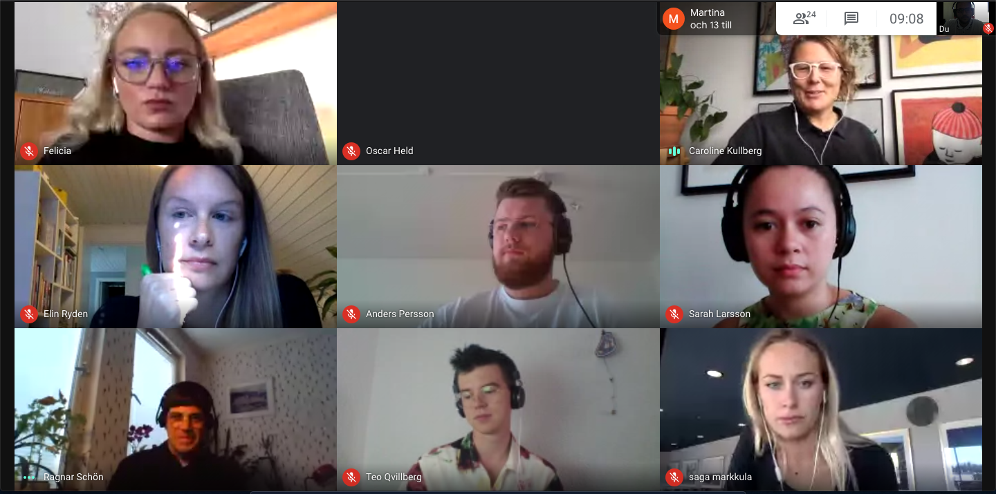
The team consisted of me, two other designers, and one UX Designer from Sweden’s Radio who was facilitating the sprint. The team got to know each other through exercises and sharing information about ourselves. It’s important to know and be comfortable with the people you work with. This makes for a smooth and creative design process.
The brief was created out of the organisations need for more young adults to listen to Sweden’s Radio.
The current digital platforms have not succeeded in reaching the young adults even though there is content specifically geared towards young adults, such as the P3 channel which is intended for young adults between the ages of 18-34.
Sweden’s Radio must continuously innovate and digitalize as they are competing with the big streaming services for the young adults attention.
User research
The team discussed the brief and brainstormed which problem areas we would like to explore more and find solutions for, as well as what the intended user group would be.
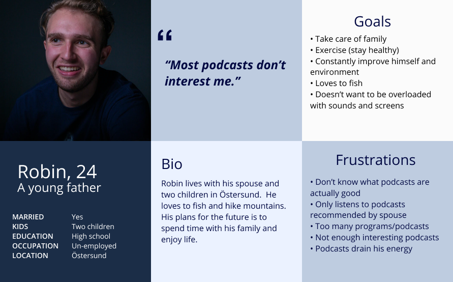
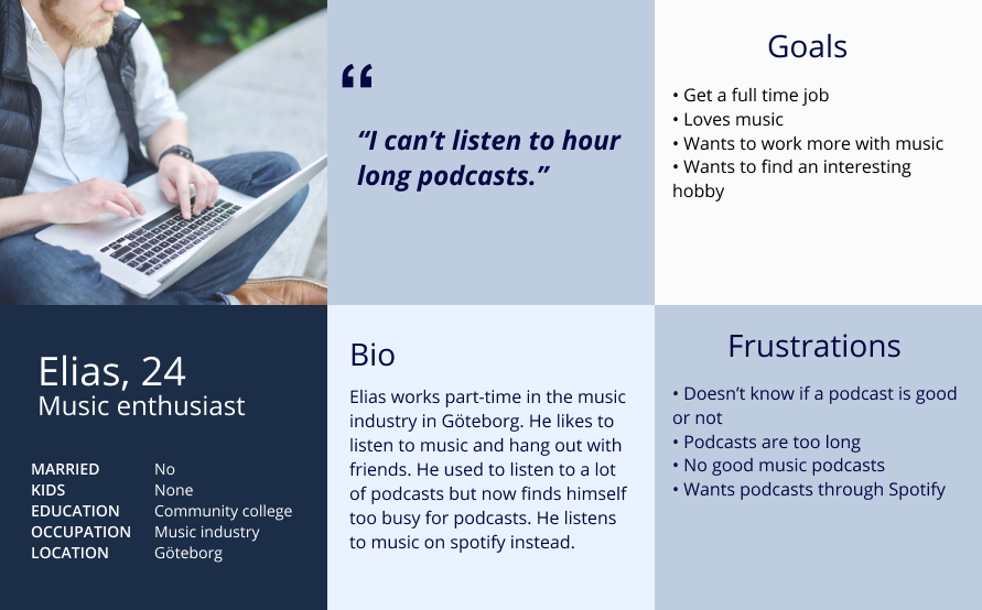
The user group would be 18-25 year olds and the area of focus would be podcast listening. Focus was on the mobile application as we knew from experience that most users listened to music and podcasts on their smartphone.
Our research found these relevant statistics for our user group (daily metrics):
- 47% listened to music
- 37% would listen to Spotify
- 12% listened to radio
- 9% would listen to podcasts
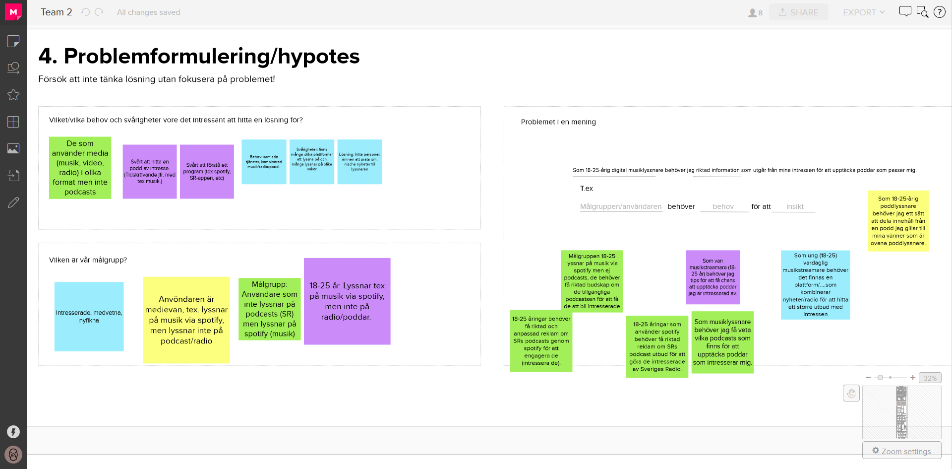
Formulating a hypothesis
The team discussed why only 9% of the users listened to podcasts every day. Was it because there weren’t many interesting podcasts? Too many podcasts? Don’t know where to find them?
The discussion finally led us to this research question that was formulated as a user statement:
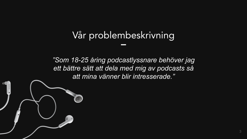
“As an 18-25 year old I need custom recommendations for podcasts which would interest me.”
The hypothesis was formulated out of the designers own experiences in combination with the user research. We believed that the intended user group could be made more interested in podcasts if they received targeted podcast recommendations through channels they trusted, for example friends and family. The question was how we would go about ensuring that the recommendations would reach the users.
Day 2. Brainstorming!
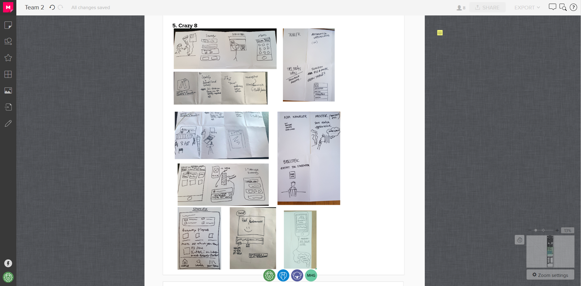
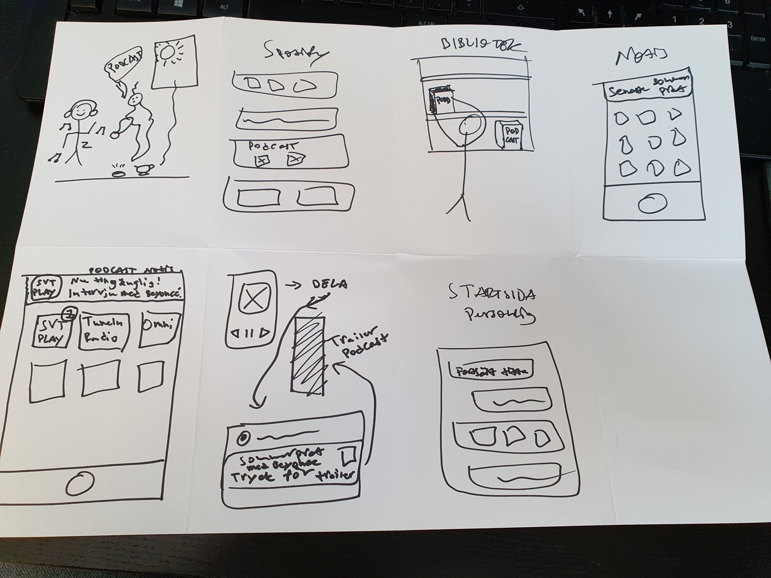
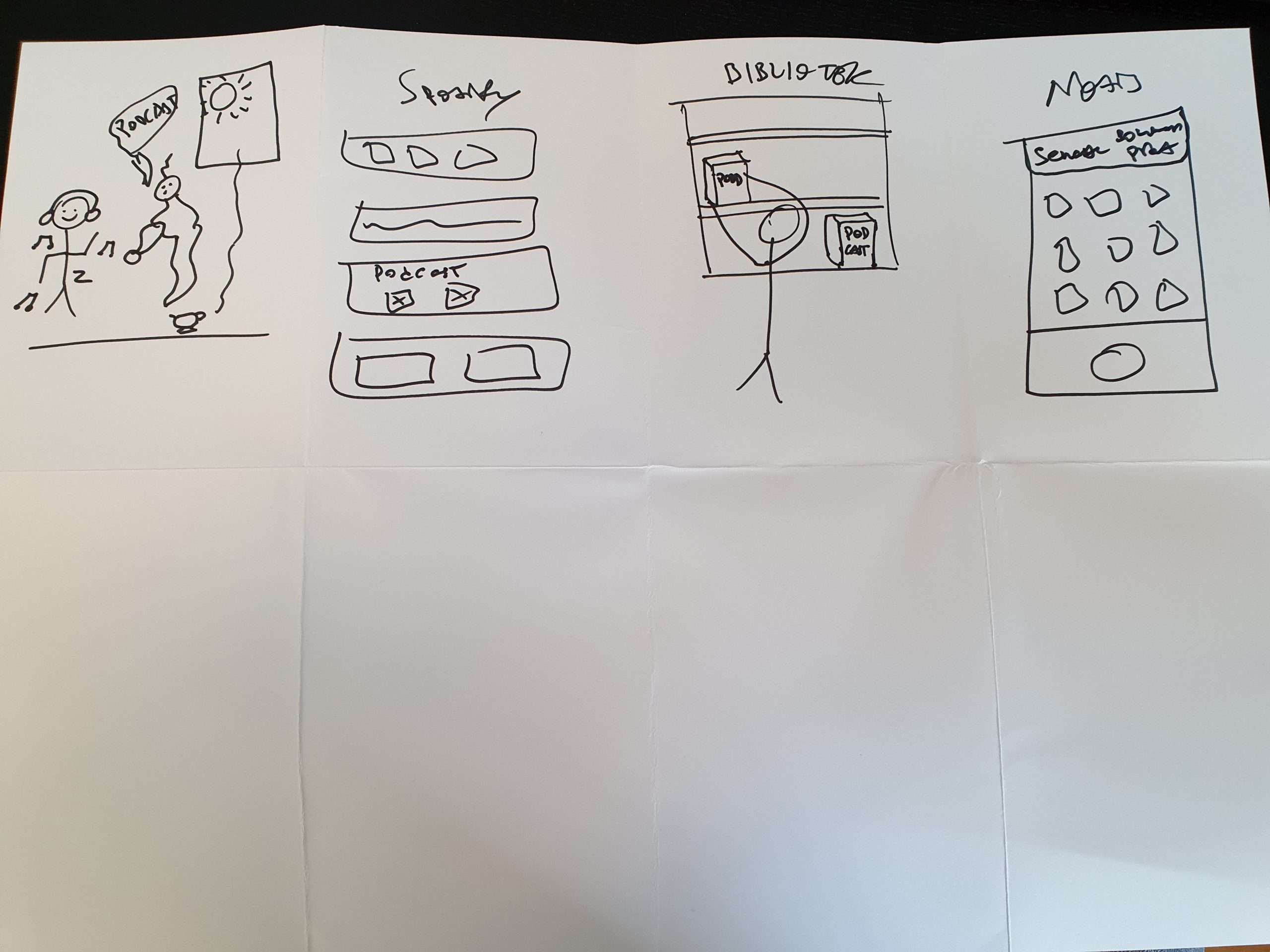
Brainstorming using Crazy-8 helped us generate an idea that we believed would increase podcast listening. Each designer sketched out 8 “crazy” ideas that were relevant to the user group, research statement, and area of focus. We then presented the ideas to each other and discussed which ideas we could realistically move forward with.
HEUREKA! We've got an idea!
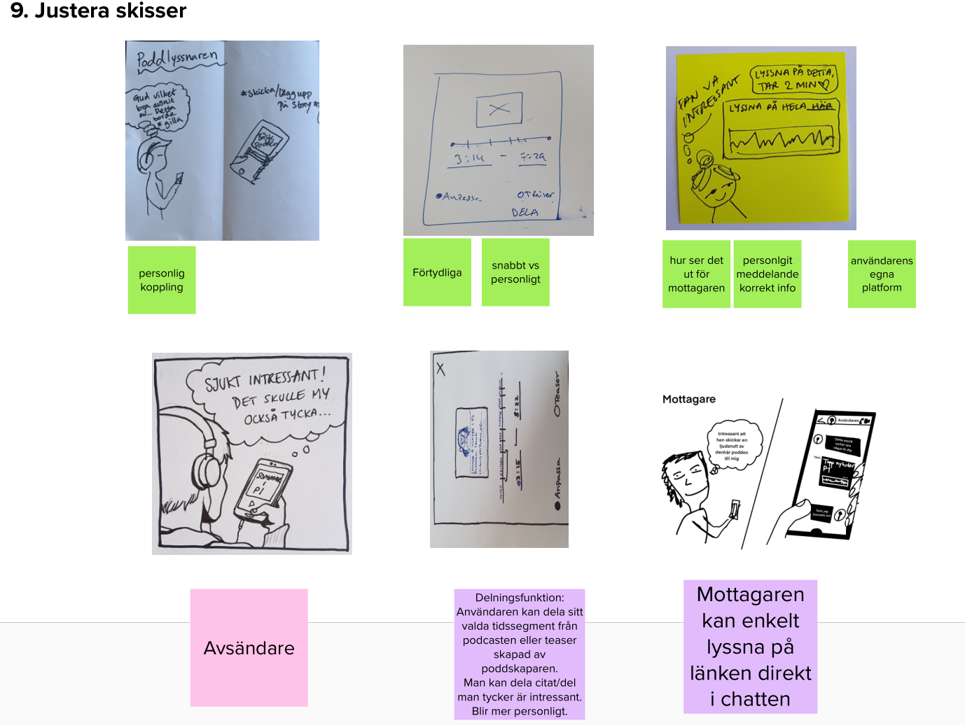
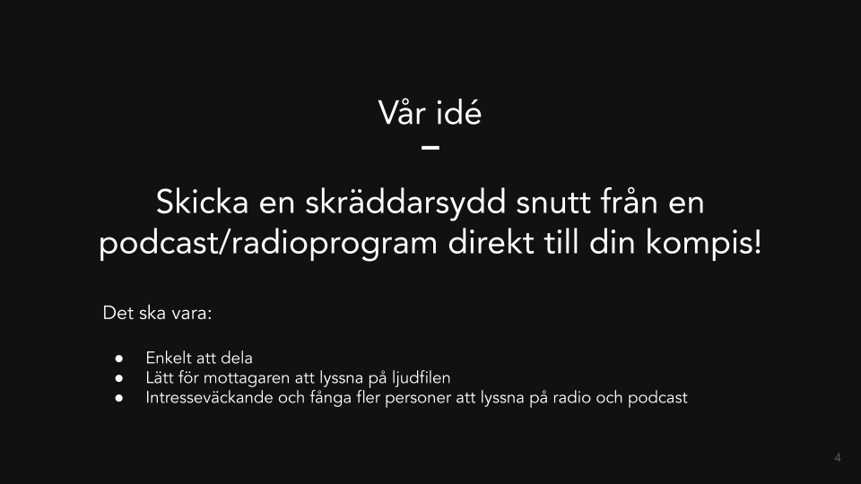
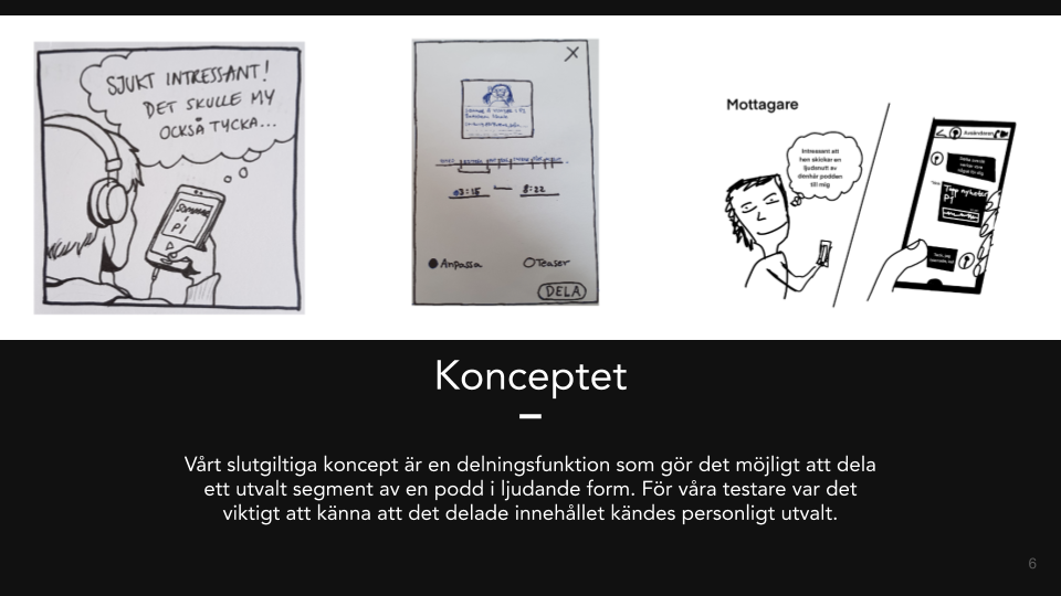
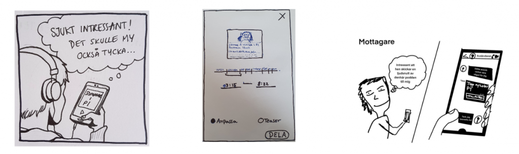
The user should be able to share specific segments of a podcast.
The user can share the podcast segment through any social media platform. The clip can then be played directly on the platform. The user that received the message has the option to listen to the entire podcast on the application of their choice.
This idea was believed to increase user listening, especially as the users are receiving recommendations from people they are familiar with and have faith in.
Current sharing function UX/UI
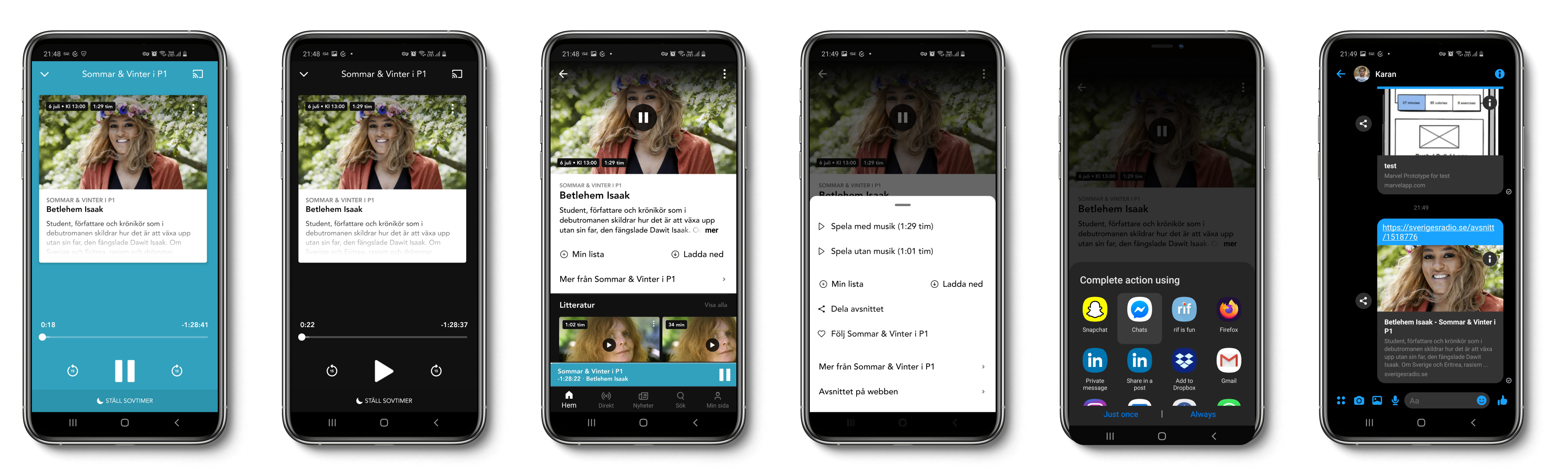
The current User Experience when sharing a podcast is not good. The user must go back to the podcast information screen and press the hamburger menu to share a podcast. It is confusing and un-intuitive.
Our idea is to place a share button directly on the podcast listening screen to simplify the UX and UI of sharing a podcast. The users do not have to leave the podcast to share it. The function should be simple and easy to use. It should be clear what the user is sharing and how it will be shared.
Understanding who the users are
To design for the users we need to actually understand the users, their needs and wants.
As the design sprint was compressed into three days there was not a lot of time and resources available for user testing.
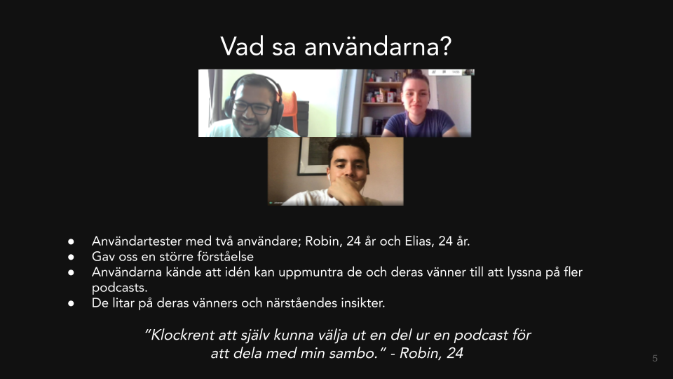
Two usability tests were conducted with users from the intended age group (18-25 year olds). The questions were asked through a semi-formal interview. It was important to get the users unbiased thoughts. The interview was constructed in a way that would enable us to get detailed information whether or not the user was a podcast listener.
The users were asked:
- what could encourage them to listen more to podcasts
- if they would like the idea of sharing specific segments of podcasts
- if the sharing function would lead to them sharing more podcasts
- whether or not such a function would increase their podcast listening
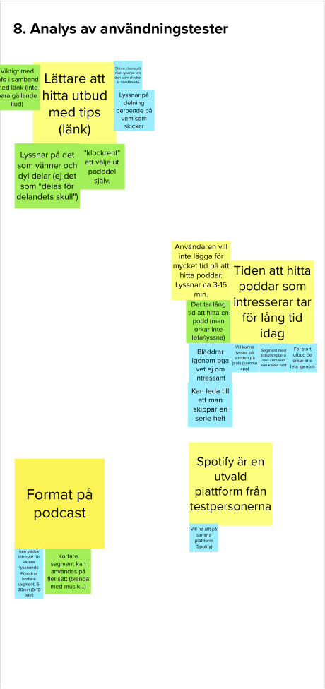
Both users were positively receptive towards the idea of being able to share specific segments of a podcast that interested them and might interest their acquaintance. They believed it would be a way to listen to podcasts without the need to commit an hour or more of your day. The function would lead to more podcast listening as they could listen to a relevant segment in a short period of time with the option to listen to the full podcast if interested.
The users shared similar perspectives;
- Important that the shared clip also displays information about the podcast
- They would listen more to clips shares by friends and family
- Great to be able to listen to a specific podcast segment
- Good that you can listen to a short clip instead of a long podcast
Analysis of the user feedback showed that our product concept would be used by the users and could aid in increasing user listening and retention. At the very least the sharing function would be improved. The current UX/UI is very lack-luster and is not customisable at all.
Design is an iterative process
This is the final stage of this condensed design sprint. Here we evaluate and re-iterate our idea according to the user’s feedback. The designers analysed the users feedback from the usability tests. The product concept was reiterated according to the user feedback. This is a key part of the design process as it ensures that the product meets the user’s requirements.
Day 3. Presentation.
Time to present our product to the audience; a mix of SR stakeholders and design sprint participants.
Results
The concept was a hit with the stakeholders at Sweden’s Radio. The key participants agreed that the concept would aid in encouraging young adults to listen to SR and its catalogue. The concept was in tune with SR’s mission statement and could be easily implemented into SR’s digital platforms.
Reflection
The design sprint was a great opportunity for me to use my skills and knowledge within UX/UI to design and create for an actual user base. The design sprint gave me a chance to dive deep into user research, concept creation, journey mapping, and the importance of team work.
If I had the chance to do this design sprint again I would spend more time on user research as that is the most important part of building a digital product. This design sprint was compressed into 3 days, a standard five day design sprint would most likely yield more comprehensive user data that can be applied to create a product that is easy to use, efficient, and available for all users (WCAG).
ea
Future plans
- Create wireframes
- Create a high fidelity prototype